

Wrinkles in Design Space
"That's the wrinkle" @markmacd
I've already covered design spaces in great detail on this blog. For a quick recap, a design space is an organizational model for understanding the creative and functional potential a designer works within. The outer limits of this space is marked by the fiction of the game. And the core from which the mechanics, enemies, and other gameplay elements are designed around is the primary function (the main action of the gameplay experience). Using this model, we can better understand how unique each game element is and what role it fulfills overall. This article will examine the design pros and cons of uneven or wrinkled design spaces.
First of all, the term "wrinkle" finds a fitting home in our design space lexicon along with touching "corners" and being "well-rounded." All of these terms have a spatial and tactile sense. But there's another clever layer to "wrinkle" that I'm only partially coining. Turns out, wrinkle already has a particularly underused definition in English. From dictionary.com a wrinkle is " an ingenious trick; a clever innovation." So, the idea we'll be investigating is whether designing gameplay elements to create uneven design spaces (wrinkles) also creates clever tricks or innovations (wrinkles) in the gameplay.
;)
click to enlarge. chart from veekun.com
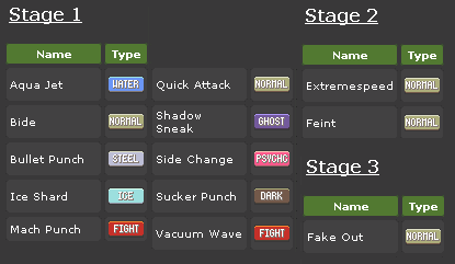
What is a design space wrinkle? It's simply when certain properites or design features are given to some but not all elements in a set. Sets can be anything like enemies, weapons, characters, etc. To illustrate, let's look at the design space of Pokemon attacks. In Pokemon Black/White there are 17 different types. Bug. Dark. Dragon. Electric. Fighting. Fire. Flying. Ghost. Grass. Ground. Ice. Normal. Poison. Psychic. Rock. Steel. And water. Though the Pokemon battle system is designed around double-blind Rock Paper Scissors interplay system, the number of counters (weaknesses/resistances) that each type has is not the same for all types. In fact, it's not even close.
For offensive attacks, rock and ground attacks are super effective on more Pokemon types than any other types of attacks (see the +1/+1; the only green values in the far right column). On the other hand, poison and normal attacks are resisted by more types than they are super effective on (see -4/-5 in the far right column). But even looking at the attack types like this doesn't tell the whole story. Dragon type attacks are only resisted by steel Pokemon and are only super effective on dragon types. This means that for 15/17 types, these attacks hit for normal damage. This is extremely reliable. Defensively, steel is the best type in the game by far with a whopping 13/17 resistances (see +10 on bottom row). As an offensive type, steel doesn't have great coverage at all. Making the types uneven like this gives Pokemon more room to make very unique types in terms of the number and balance of weaknesses and resistances. Uneven design spaces allows elements to have more diverse and unique functions/roles in the game.
Looking at the design space of Pokemon types this way still doesn't put the whole picture into perspective. There are two main types of attacks in Pokemon: physical and special. Each Pokemon has a value for physical and special defense allowing for more variation of defensive strength and counters than with a mono-value defense system. However, if you look at all the attacks of a single type, you'll find that the design space isn't evenly divided between physical and special attacks. Such a design allows room for variation while establishing some level of regularity. When most of the elements have a property, that property becomes more of the norm making up the base of expectations.
Let's look at grass attacks. The most powerful grass attacks that can be learned by the most Pokemon are special attacks (energy ball & solar beam). This means, when defending against an incoming unknown grass attack, you can hedge your bets and pick Pokemon that resist grass attacks, have high special defenses, have light screen support, or some combination of these measures. Still, there are some physical grass attacks you may have to worry about. But because much fewer Pokemon can learn them, you can generally make very informed decisions based on the specific matchup. If you look at rock attacks only 2/11 attacks are special and they're not very strong. You know what to expect from incoming rock attacks.
 info from serebii.net
Another example I noticed of uneven design spaces in Pokemon are priority attacks. In battle the Pokemon with the higher speed stat goes first in the turn. Some exceptions include priority moves. Using a move with positive priority (stage 1, 2, or 3) puts your Pokemon on a new tier of speed. The Pokemon on the higher tier always goes first. If two Pokemon are on the same tier, then the faster Pokemon wins. In general, priority attacks are relatively weak power wise. So, with the attack mach punch on a slow Pokemon like Conkeldurr who rarely outspeeds anything, the player can decide to hit first with the priority attack or hit hard with a different attack. If you're thinking that there's a priority attack for every Pokemon type in the game, you should know that only 7/17 types have priority attacks. Furthermore, only 11 out of 455 moves are priority attacks and are mostly physical. Making the design space uneven in this way works to balance out the overall gameplay. To play with priority, you have to utilize a small range of Pokemon and types. And in a system where correct predictions are powerful, being too obvious can be your undoing.
Take Street Fighter 4 for another example. Characters in this game have about 30 moves. Some can be executed in the air, but most work only on the ground. This is the first level of uneven design. In the air nearly all attacks hit standing opponents high. While on the ground players can switch between high and low attacks. Since low attacks must be blocked low and high attacks can be blocked high or low, defending players will tend to block low. To beat low blocking players, you can grab or use an overhead attack. Each character typically only has one grab and one overhead each. So the design space of attacks are weighted toward ground attacks that don't grab, overhead, or sweep. And since ground attacks start combos better than air attacks, the uneven design space of SF4 is weighted toward ground based combat. Fortunately, because of pattern based mixups and mixups of other types, a wide range of moves are viable despite their coverage in the design space. Grabs are common. Overheads are uncommon to rare. Sweeps are common to uncommon. And air to air attacks are uncommon. The Capcom designers knew that just because a move type is small in the design space doesn't mean it doesn't play an important role in the gameplay.
If you think about it, if the entire design space of the core mechanics or interactions of a game didn't have uneven elements, the variation and interesting choices become significantly limited. Think of the perfectly balanced game Rock, Paper, Scissors. No matter what you pick, you have the same chances of winning according to the rules. This design makes any option you pick largely meaninful based on what your opponent throws. The strategy involved is always contextual or relative. Even with the expanded versions of this game, you still have the same chances of success or failure no matter what you pick. No one option is better. No one option stands out. There's little inventiveness or cleverness of player choices. Designing elements unevenly is an important part of what makes options not equally attractive which is a necessary component of game design that supports interesting choices.
If creating at least one element to fulfill the main roles within a design space is touching all of its corners, then wrinkles are like rounded corners. By not being too sharp or too dull (smoothed flat, homogonous, optimized) creating wrinkles in game design can strike a balance between variety and interesting functionality. Wrinkles create wrinkles in your brow and brain as you wrestle with the asymmetrical big picture. Wrinkles force us to recognize and embrace the specifics of gameplay complexities because they present complexities that are harder to optimize. We think things like "that's odd, not everyone can learn this?" or "I guess that makes these guys special."
I love uneven wrinkly design spaces for the same reasons that I love characters with quirks in my stories or snapshots that frame subjects off center. The variety, uniqueness, and emergent potential increases with wrinkles. On the other hand, for games with increasingly many customization options, the variety potential decreases. This is probably why I don't like too much customization in my video games. I'm not particulary fond of the job system in Final Fantasy 5, the custom CO system in Advance Wars: Dual Strike, or the general concept of full customisability. If you can make anything anything then everything potentially blends together.
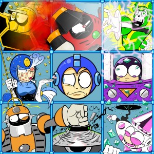
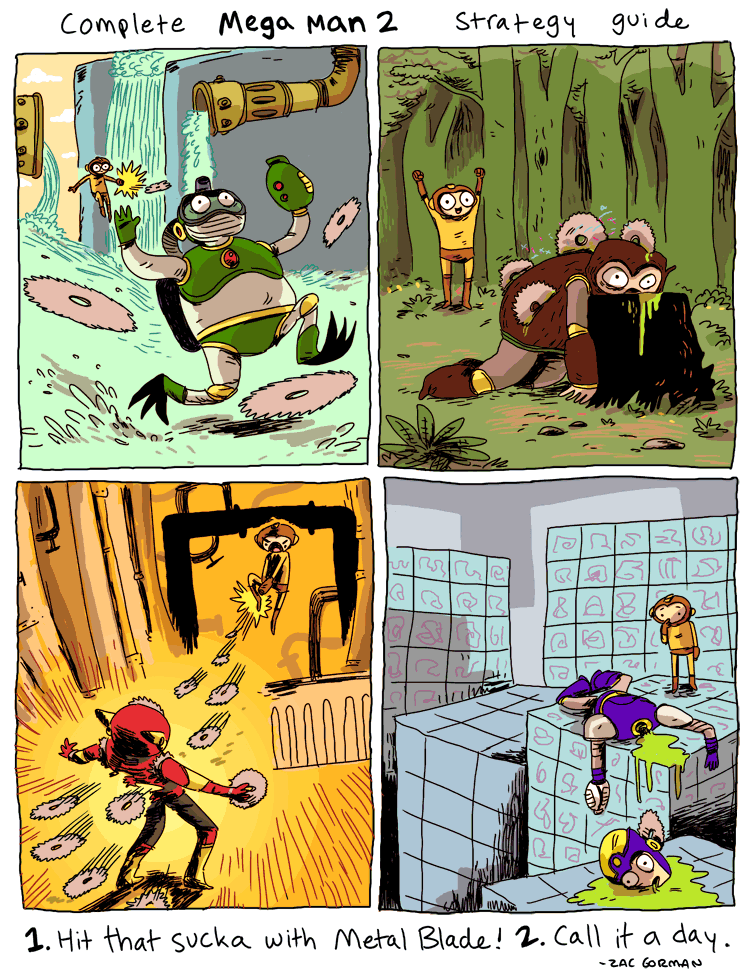
Many of the classic Mega Man games feature robot master (bosses) weakeness. This is a great example of a perfectly even design space. The idea is the weapon gained from each boss is "super effective" on another boss. Many gamers believe that the only way to be successful at these Mega Man games is to learn the "proper" order playing to each boss's weakness. Of course, playing this way is completely optional. This smooth design space is great because it's straight forward. Because the game is mostly designed to be played well with just the M.Buster (the default weapon), the boss weaknesses didn't need to add an uneven layer on top of it all. Not all Mega Man games are like this though. Metal Man's power from Mega Man 2 devestates a lot of enemies and bosses (see here). Compared to other Mega Man games having one power weapon that's more useful than the others is creative. However, the Mega Man game's aren't designed with enemy and boss AI that counter the weapons you have. This is not an open multiplayer system with a metagame. Mega Man challenges are relatively static, so the Metal Blade power became a dominant strategy that reduces variety in this case. Uneven, wrinkly design spaces can reduce variety depending on how central the element is to the core gameplay and balance.
Of course the word "wrinkle" can be used outside of the topic of design space. And surely what makes a feature innovative or clever is somewhat subjective. Still, I think it's more useful to think of wrikles as design elements that help interesting choices emerge or DKART skills to be stressed in a more complex and layered way. Using all of our critical-language and understanding of game design, it shouldn't be a problem for us to separate the wrinkles from the bumps.
 Richard Terrell (KirbyKid)
Reader Comments