If Wall-e (the movie) Was A Game
 Monday, June 30, 2008 at 4:00PM
 I'll keep this one brief and spoiler free. All images are taken from the online trailer of Wall-e.
If Wall-e, the fantastic new addition to Pixar's powerhouse of films for all ages, was a game it would be a perfect example of...
- visual storytelling
- form fits function
- characterization through action
- clean (virtually spotless) design/story telling
The dialog in Wall-e is sparse at first. Aside from the lyrics in the music and the audio track from a video feed shown early in the film, Wall-e starts off like a silent film. The crafters at Pixar truly took advantage of the freedom, power, and flexibility of visuals, the heart of films. Instead of bogging down the film with unnecessary explanatory dialog, Pixar let the images do the talking. Throughout the film just about everything the viewer needs to know can be extrapolated from the information easily gathered from the visuals, which are the most advanced and technically impressive computer generated visuals I've ever seen.
Such an unyielding dedication to the visuals in Wall-e allowed Pixar to create a film where the forms of the various robots, characters, and locations fit the function of the characters which, in turn, yield actions that make up the foundation of the story. In other words, Wall-e is filled with visual metaphors that are made to work for the film's story and themes.
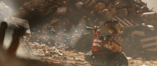
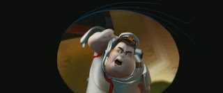
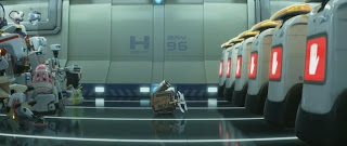
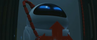
From the dirty ground hugging robot in the first image, to the obese man, to the line of robots to the right in the third picture, to the red cable attached to the robot in the last image, all of these details are important to Wall-e's story and progression because of their function. That's all I'll say about that now as to avoid stepping into spoiler territory.
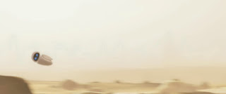
Once again, without dialog the characters in Wall-e can't simply explain their life stories or motivations to each other. Being able to gather each character's function/role in the story simply by observing their form can only go so far. Fortunately, Pixar fully embraced the idea of using action to characterize its characters. In the image above, the way this character flies around helps create and define her character while strengthening the visual metaphors within the film.
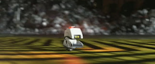
Also, there are many robots that are designed to do various tasks/functions throughout the film. Because these robots aren't humanoid, they're design typically locks them into only being able to do one task each. Even within these constraints, the various characters are able to define and express themselves to a large degree (especially the little guy in the picture below). Restricting options and variables can be a way of delivering a more clearly communicated product.
Most impressive of all is how clean a film Wall-e is. Remember my article on Reducing the Clutter? The cleanness of Wall-e is analogous to that. From the very opening of the film, I felt like not an image, word, or moment was too much or wasted. Every scene and every action was just long enough to convey an important part of the story and no longer.
Also, because of tight control over the visuals, forms, actions, and how that developed the characters and story, coming to the conclusion that Wall-e is the cleanest film I've ever scene is only a matter of connecting one scene to another as if drawing lines on the story board. If I had the story board I would show you what I mean. But I don't. So, you'll just have to watch the movie for yourself while keeping my comments in mind.


