Sonic: The Core Design and Beyond pt.1
 Monday, January 26, 2009 at 10:24PM
 For those who have been following the critical-gaming blog, you know that I've been trying to write an article on the 2D Sonic games for about half a year now. When I had originally revisited the games, I was simply trying to remind myself of why I liked Sonic so much when I was a kid. At some point in my investigation, I became curious to get to the bottom of the Sonic vs. Mario debate. Last year I analyzed the core 2D Mario design and applied what I learned to the other games in the series. Now, after having played every 2D side scrolling Sonic platform game I could get my hand on, I think I've figured out the essence of Sonic.
In this three part series I'll examine the core design of the 2D Sonic games, explain in full detail why the Sonic Rush games are the best Sonic games, and consider the design paths that Sonic should take to to make a quality, next-gen game.
The following is a look at the core design of the 2D Sonic games that is largely consistent between Sonic 1, 2, 3, Sonic & Knuckles, Sonic Rush, and Sonic Rush Adventure. Througout this section, I will compare the design of Sonic to the design of anlogous elements from Super Mario Brothers.
Core Mechanics
- There's not much to say about the design of Sonic's core mechanics. His JUMP is quick and springy. His DUCK while moving turns into a ROLL mechanic that works well with the game's physics especially on hills and other slanted surfaces. The SPIN DASH that was added after Sonic 1, gives players the ability to burst forward at high speeds from a standing position.
- The core mechanics and controls are solidly designed. From here, it's up to the designers to create levels that make use of the core player mechanics.
Ring Design

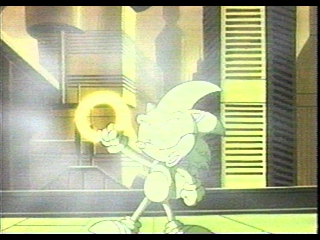
- Though I along with many others have mistakenly called rings coins, it is ironic that the functional parallel between rings and coins mirror their visual parallel. Though both are shiny pieces of gold suspended in the air, the coins in Super Mario Brothers are designed to encourage and reward the player for diverse and challenging platforming. Each coin in Super Mario Brothers is arranged so that they can be obtained without having to play through the level again. Every 100 coins, players earn extra lives. These design features make coins in Super Mario Brothers solidly designed. You can read more about Mario coins here.
- The rings in Sonic, on the other hand, have a large gaping hole in the middle of their function when compared to coins. Rings aren't arranged so that players can grab all the rings they see. There are moments when the rings are arranged in large groups that the player can pass through only once. Because some rings can't be obtained in one play through, the encouraging function of the rings becomes diminished. For these rings, instead of saying "you can do it. keep trying," they say, "too bad you missed. better luck next time."
- Every coin in Super Mario Brothers was carefully arranged so that they weren't put in the path that the player must go through to progress. Coins are a reward for going out of one's way, not taking the only path available. This design makes each coin earned and well valued. In Sonic, rings are placed in areas that players must go through including on platforms, over springs, and around loops. These rings feel like pity offerings.
- Because the ring count isn't carried over from level to level, suspension isn't created. In Mario, players can develop strategies around collecting rings across multiple levels to earn extra lives. In Sonic, all efforts to collect rings to earn extra lives must be completed before the end of each level. If you reach the end with 99 rings, that's just too bad. You'll start with 0 rings at the beginning of the next level.
- In Super Mario Brothers Mario can only take a maximum of 2 hits before dying. Sonic, on the other hand, can survive all types of hits (except for being crushed and falling into pits) as long as he has one ring. Instead of being an optional layer of influence on top of the core gameplay like coins, rings are integral to the players survival. Players need rings to survive, and when Sonic gets hit, all of the rings that have been collected scatter out from the player. This design creates a type of dependency on rings not to mention a degree of static space that is functionally equivalent to attack-attach-heal. As long as the player has rings and can pick up at least one after being hit, they're free to play recklessly. This static gameplay generally occurs during boss fights because of the enclose fighting area.
Enemy Design

- Sonic is much more aggressive than Mario. With the ability to curl up into a spiky ball, sonic can destroy enemies while rolling along the ground or traveling through the air. While in the air Sonic can attack enemies from above, below, or from the sides. This design reduces the amount of influence a single enemy has on the player when compared to the Mario enemies. Instead of forcing the player to jump on top of the enemies to defeat them thus engaging the game's core dynamic (gravity), Sonic can barrel through enemies in so many ways that the enemies hardly influence players at all. As long as Sonic is in ball form, for the most part, he's safe.
- The enemies in Sonic don't feature much interplay. They're either slowly moving about, throwing/shooting projectiles, and/or exposing their spikes. The enemies are are either alive or completely destroyed. The enemies aren't typically arranged to layer together or positioned in a way to influence the player to maneuver in unique ways. As players zoom through each level, the enemies are either destroyed in the process or left behind and forgotten. You can read more about the interplay of Mario enemies here.
- Sonic enemy elements also don't telegraph themselves to give the player enough time to effectively react to them. The fireballs and Piranha Plants in Super Mario Brothers reveal themselves on screen before Mario has a chance to run unexpectedly into them even when moving at top speeds. Many hazards and enemies in Sonic are positioned in a way that players have to memorize their whereabouts to avoid them safely. The more memorization these elements force on the player, the less play exists in the gameplay experience.
- For these reasons the enemies in Sonic aren't designed to carefully shape, influence, and develop the platforming/action gameplay experience. More so, the Sonic enemies simply add an occasional annoyance/threat that increases the amount of memorization in the game rather than play.
Level design

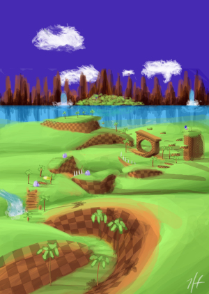
incredible image by UpaUpa on Deviantart
- Contrary to what many believe, the classic Sonic games (Sonic 1, 2, and 3) aren't so much about speed as they are about flow. However, moving between one game idea and the next smoothly isn't a quality exclusive to Sonic. Even Mario and Mega Man have the ability to go from the beginning of a level to the end without stopping. At their best, the Sonic games create a strong sense of forward momentum. At their worst, the player is stopped frequently and slowed to a crawl progressing through gameplay ideas that aren't very interesting.
- The 2D Sonic games have always wrestled with the limitations of the screen display. The faster Sonic moves, the harder it is for players to see upcoming hazards in time to make informed decisions. If you can't see that bump or rock coming, they become jarring stops in the flowing action. Mario was carefully designed so that players can always make accurate decisions about the upcoming challenges. Read more about Mario's design here.
- The amount of breaks in Sonic's flow increase with speed of Sonic's movements. This is especially troublesome. The better/faster a player gets at the game, the more likely they'll come to an abrupt stop. Being slowed by enemies or bumps is easy enough to deal with. But when you can't see an upcoming pit in time, it could cost you a life. Most players resort to memorizing deadly parts of a level to progress safely.
- Many of the branching paths that Sonic is so well known for aren't very different from each other. Often times, the difference between one path and a branching path is merely a couple of steps before the paths recombine.
- The amount of level transformation is low, and even these examples don't influence the core gameplay significantly. In other words, the occasional push block or breakaway wall are either required for progression or they open up access to a branched path.Without enough level transformative abilities, players move through the level instead of expressing themselves by actively changing it.
- What's worth noting about Sonic's level design isn't the mechanics, how the elements influence gameplay, the interplay (or lack thereof), or the layered counterpoint (which it doesn't have). What works with Sonic's level design is that it's functionally similar to a roller coaster or amusement park ride. The lack of significant variation due to the shallow level and enemy design puts the emphasis on the game "experience" rather than the game "play." Sonic is all about experiencing the "ride" that's composed of the strong forward momentum. The more cool looking obstacles, jumps, loops, secrets, and enemies the designers can put into a level regardless of how well these elements shape the gameplay, the better.The more elements the player can zoom past, the more they feel like they're outracing even if these elements are basic or shallow.
The 2D Sonic games are perhaps the most popular example of this roller coaster design. Tomorrow, I'll explain in full detail how the core design in Sonic Rush has refined the core roller coaster Sonic design and why the two are my favorite Sonic games.
 Platformer,
  Sonic in
  Enemy Design,
  Genre,
  Level Design,
  Mechanics,
  Misc Design & Theory |
  Permalink |
  Print Article
