Mario Klutter
 Thursday, May 1, 2008 at 4:50PM
 Over the years the Mario Kart formula has been tweaked ever so slightly with every iteration. Five games after Super Mario Kart comes Mario Kart Wii. Though the latest version is played with wheel instead of a controller, features 3D graphics instead of 2D mode 7 graphics, and supports up to 12 players online play instead of 2 players offline play, these differences aren’t want makes Mario Kart Wii so different from the original. In my previous essay, I described how Super Mario Kart is structurally similar in design to Super Mario Bros. The elements in both of these games are so tightly woven together, changing one thing by a minute degree can throw everything off. So now we have Mario Kart Wii. And it appears that, compared to the original, everything was changed by a significant degree. The result, a game that is cluttered with design choices that detract from the whole by stretching the game abnormally in a particular direction. The purpose of this essay is to highlight the current design trends as seen in Mario Kart: Double Dash, Mario Kart DS, and Mario Kart Wii and consider how these trends have cluttered Mario Kart.
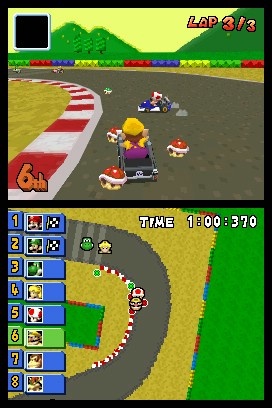
Every Mario Kart game includes a similar set of HUD items while racing including time, player rank, a map of the course with racer positions, and what item the player is holding (give or take current lap, who the top four racers are, and speedometer). Depending on the game, a different combination of HUD items are displayed. Mario Kart DS presented the cleanest most flexible HUD display with the most information out of all the Mario Karts. The top screen on the DS is for displaying the game as well as the lap, item box, and player rank. The bottom screen displays either a birds eye view of the player or a mini map. On either view the positions of the other karts are clearly marked. However, on the birds eye view, items on the track, item boxes, and incoming attacks are also displayed allowing the bottom screen to function as a rear view mirror.

A list of the current ranks of all the karts is also displayed on the bottom screen. This list not only displays rank but which item each character is currently holding. This level of detail is great for spotting if another player has a powerful item giving players a chance to prepare ahead of time. Mario Kart: Double Dash and Mario Kart Wii only have one screen to squeeze their HUD onto. The wide screen support in the Wii version helps reduced the cramped feel. Perhaps there’s a better way to reduce the HUD clutter than playing on a bigger TV. Double Dash was heading in the right direction by designing a form for holding items that is clearly visible to the player and other racers in the game. In this game characters hold and even juggle items in their hands. If another Kart has a star, you’ll clearly be able to see that they do. This feature supports the stealing items mechanic. By boosting into, ramming in star mode, or slide attacking another kart, players can steal their opponents items. Any time the form of a game can intuitively and naturally do away with HUD is a good design decision.
Form fits function is a powerful game design philosophy that a Classical game designer would swear by. The Mario Kart games operate on two main sets of forms. One form is the kart racing form which includes actions like bumping other karts, tight turns, and even some power sliding. The other major form is the Mario form. Though a game normally employs forms that are rooted to the natural world or some other established convention, over time, similarities within game series can create their own forms that have associated functions all of their own. Now, whether a banana is in Mario Kart, Mario Strikers Charged, or Super Smash Brothers Brawl we expect it to function the same; causing people to slip up without giving them damage.
In Mario Kart it is important that the areas that look like grass act like grass as well. Driving through gravel or grass must slow down the player significantly so that the form of the gravel or grass matches up with how it functions. This is the same for walls. A wall can’t simply slow you down when you run into it. It must stop you. The goal in a Mario Kart race has always been to get to the finish line first. The penalty for driving through the grass must significantly detract from achieving this goal. In Mario Kart DS, certain combinations of karts and characters allowed players to drive through grass and gravel at high speeds. Instead of penalizing players for driving off the track, they are rewarded with new short cuts. In the same game, heavy karts and characters are reduced to a slow crawl when off-roading. The bonuses created from the “right” combinations of characters and karts weren’t balanced against the normal or “bad” combinations.

The problem with designing Mario Kart with different stats or attributes for each character and kart, is that it reduces the complexity of the game. From Super Mario Kart to Mario Kart: Super Circuit, choosing a character meant choosing a play style. Though stats weren’t displayed in all of these games, there were differences in how each character played. Fortunately, the differences were easily interpreted from the form of each character. Big characters like Bowser were heavy and could knock other karts out of the way with ease. However, the added weight made for slower turning and acceleration. On the other hand, a small guy like Toad was a light weight with top level acceleration and sharp turns. Extracting weight, speed, acceleration, and turning from the form of each character was only natural and intuitive.
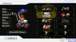
Unfortunately, from Mario Kart: Double Dash to Mario Kart Wii, the developers decided to demolish this connection between form and function by adding the ability for each character to race in more than one type of kart. With each kart came a set of stats that varied from kart to kart and character to character. Now the correlation between form and function is stretched. Not only do players have to recognize the character driving the kart, but they have to understand what kind of stats the kart has. Having two factors to consider isn’t necessarily bad. But as the design of the karts became more creative, fanciful, and imaginative, the function the karts have was decoupled from their form. Now a small military tank has more acceleration than a race car, and an egg on four wheels has more handling than almost every other vehicle in the game. Memorizing these differences is a chore that ignores the power of form fits function to communicate the rules and parameters of a game world.
What’s worse is, whenever the player is given the ability to alter the attributes of their characters, the changed stats will inevitably do one of two things: augment their inherent abilities, or nullify their deficiencies. One way or another, changing the stats of a character is essentially changing the character. If I took a small light weight character who has high acceleration and low speed, and I pick a kart that reverses these stats, I essentially changed my character into a heavy style character. Because the stat changes have to be significant so that the changes are reflected in the gameplay, the different possibilities only muddle the results by transforming a character into an hyperbole of itself, or making the character more like everyone else. At the same time, the range of variation between the form and the function increases deluding the design of the game.
Excessive stats can easily clutter a game like Mario Kart, and Mario Kart Wii features 7 different stats: speed, weight, acceleration, handling, drift, off-road, and mini-turbo. Fortunately, the range of karts available are separated into 3 classes based on character size unlike in Mario Kart DS where every character could ride in every kart. However, stats are an abstract way of communicating game rules and parameters. It would be best if the designers could design Mario Kart so that the 7 stats could be intuitively discerned from how the kart and racer appear.
Finally, the Mario Kart Series has began to show clutter in the number of players that can participate in a single game. Mario Kart Wii supports up to 12 players, and, following the trend, the developers have added more item boxes. Mario Kart has always been a game where the players in the back can effect the players in the front. Lightnings, Ghosts, and Bananas are just a few ways everyone in the race can stay connected. Mario Kart Wii added more items that effect a range of players. Though the ghost was removed, a decision I don’t completely agree with, the POW block, and Blooper were added. And with more karts in the match, there are more chances for these items to come into play. Since Double Dash, items can fall out of players possessions and onto the track. This in itself can clutter up the available racing lanes with bombs, turtle shells, and other hazards. In Mario Kart Wii, both the lightening bolt and the POW Block knock items onto the track. With space more precious and limited than ever, I’m surprised the developers made the game so chaotic and cramped.
The punishment for getting hit by an item isn’t significant enough because there’s naturally such a high volume of items and other hazards in the game. Specifically in Double Dash, even the Mario Bros. special item fireballs only made other karts spin out briefly as if they hit a banana. When each element and item in a game isn’t distinct and significant, the overlap in effects only dilutes the overall design. When many items fall to the tracks as hazards, this reduces the unique quality of bananas. When a Bullet Bill moves beyond a kart’s top speed, is invincible, and steers automatically, this reduces the impact of a Star. When Yoshi’s and Birdo’s eggs home in on other karts and explode with even more items, this reduces the uniqueness of red shells.
More isn’t necessarily better. The latest 3 Mario Karts have added more tracks, more items, more characters, and more kart options, yet the gameplay in all three has become cluttered compared to their predecessors. Over all, the differences between the Mario Kart games can be very slight. Even so, small design choices can give any game focus or cause it to spiral off into a sea of muddled obscurity and clutter. Every Mario Kart is designed to focus on a different aspect of its gameplay. Mario Kart Wii seems to be all about playing with more people at a single time. Though I would have preferred focusing on racing, or battling mechanics, Mario Kart Wii is still Mario Kart, no matter how cluttered it is.


