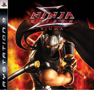
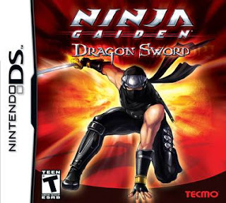
1up's Shane Bettenhausen gave Ninja Gaiden: Dragon Sword for the Nintendo DS a favorable score because of of the game's tight controls, sharp visuals, and distinguished unique feel unique to the handheld machine. This DS game received an 83.1% average score on gamerankings.com while its "older brother" console counterpart, Ninja Gaiden: Black/Sigma, received a 94.0% score.
Comparing the two games was inevitable. Some have created expectations that are different and often times lower for handheld games These gamers believe that handheld games are inherently less deep and complex with shorter overall gameplay experiences, which are better suited for playing in small bursts. I don't believe any of these conditions are inherent to handheld games. The principles of game design can be applied to any game. The better we understand these principles, the more it becomes obvious that games are games no matter what system they're on.
Itagaki and the developers at Tecmo/Team Ninja set Ninja Gaiden: Dragon Sword up nicely to be compared to Sigma because the majority of animations, enemies, bosses, and locations are the same between the two games. Having beaten Ninja Gaiden: Sigma, jumping into Dragon Sword was like picking up right where I left off. As you can see, the two games appear to be nearly identical.
The bottom line: Ninja Gaiden Sigma is better for its combat and presentation, while Dragon Sword is the cleaner game due to the dual screen support and touch screen controls.
- Sigma has a strong sense of space in regard to enemy and player positioning within the fighting environment. The hitboxes for attacks are discernible making near hits and dodges accurate and exciting. The environments have vertical height and solid boundaries that allow Ryu Hayabusa (the player) to throw enemies into walls, wall kick, and run along extending the variety to every battle.
- Dragon Sword's battles are cramped because everything has to fit on the touch screen. While a small screen isn't an issue in itself, the developers decided to display the game at a particular zoom level that shows off the animation in the game. This means the more detail you see in the character and enemy models, the less room there is on the screen for anything else. The player to enemy interaction through the creation and then violation of personal space is significantly lessened in Dragon Sword. In this game, attacking and moving are more closely integrated together blending spacing, attacking, and defending into a single often blurry action. Also, because the backgrounds are 2D, interpreting them as 3D space and then maneuvering around them using a 2D input can be quite difficult. This is why Dragon sword features so little "vertical geometry."
MOVES AND MECHANICS
- Sigma has an exciting combat balance. The player is equipped with all the blocks, dodges, projectiles, attacks, grabs, and shield breakers they need to handle any situation. This makes battles furious. Decapitations, ground stabs, ultimate techniques, and ninpos give the battle a pace that accelerates as players encounter and take out each enemy. Each of these special moves can dispense with most enemies in one shot. The draw back in using them is in their set up and execution. Throw in a impressive assortment of weapons (DRAGON SWORD/PLAMSA SABRE MK II/TRUE DRAGON SWORD/NUNCHUKUS/VIGOORIAN FLAILS/LUNAR/DRAGON CLAW & TIGER FANG/DABILAHRO/KITETSU/WAR HAMMER/WOODEN SWORD/UNLABORED FLAWLESSNESS/DARK DRAGON BLADE) that feature pages of different moves that have all been flawlessly animated, and you have a great foundation for a battle system.
- Dragon Sword only has one weapon. And the move list for attacks are paltry at best. It's not the DS's fault, and it's not due to the limitations of the touch screen. I think there wasn't a need to include more moves given the limited visual fidelity coupled with the lack of a strong sense of space. In other words, why have a ton of attack animations when you can hardly tell the difference between then. Furthermore, the enemies wouldn't respond to the move differences which would ultimately give the different moves the same function essentially turning them into the same move. What is most disappointing is that Dragon Sword doesn't have strong combat interplay to create a sense of acceleration. Enemies come in small groups and have little to counter Ryu's ninja assault. Simply slashing away not only puts up an offense, but a defense as well as Ryu automatically blocks when the stylus is on him. The combat strategies are so powerful and apparent, that there's little to learn. Furthermore, if the enemies don't challenge the player, then the freedom that is created only restricts the gameplay experience.
BROKEN MOVES
- In Sigma, using ultimate techniques (UTs) and ninpo came at a price. Though UTs made Ryu invincible for a short period of time, the combo of moves have a limited range often only hitting a few enemies at a time. Pulling off a successful UT in the heat of battle requires planning and strategy. Ninpo, though spamable, safe, and powerful, are limited in the number of times they can be used.
- In Dragon Sword, the basic level UT unleashes a flurry of attacks and homing energy scythes that seek out enemies practically doing the work for the player. Because these scythes stun the enemies, the player has an easy opportunity to do it again. And again. And again. I assume that making homing projectiles for the UTs was a way to remedy the DS screens limited scope while also making the game easier to pick up and play. Likewise, Some Ninpo spells home the enemies or bosses. These moves are so effective it's possible to beat some bosses in under 30 seconds without even aiming at them. Finally, the arrows have unlimited ammo. Now it's possible to shoot down bosses from a distance without engaging it at all with sword attacks. The way these moves are designed in Dragon Sword limit the already stunted combat design.
ITEMS
- Ninja Gaiden: Sigma is a game with a lot of clutter in its design. I commented before on how BioShock functions like an RPG by lending to an "attack-attack-heal" strategy due to its heal button, and Sigma suffers from the same problem. The menus based RPG style design with Sigma's item management adds to the general upkeep and clutter of the game.
- In Dragon Sword, the gameplay has been streamlined. There are no more healing items to use, or any other kind of item. In this game, players survive by the skill of their sword and nothing else. This feature focused the gameplay on combat with little to distract the player. Though having unlimited arrows was a large contributing factor for Dragon Swords low difficulty, it nice not to have to search around for refills on ammunition.
LEVELS and PUZZLES
- The puzzles in Sigma were little more than fetch quests, but this isn't necessarily a bad thing. By keeping the puzzles to a minimum, the game can stay focused on the combat. Unfortunately, the poorly designed level-puzzles still distracted from the heart of the game occupying the players time and thoughts with repetitive navigation especially though needlessly complex stages.
- Each level in Dragon Sword is fairly straightforward. The levels are designed with few turns and even fewer dead ends. Picking the wrong path sets the player back 30 seconds at the worst. With the map permanently displayed on the DS top screen, navigation is easy. At a glance, the possible routes can be seen, giving the player all the important information they need to complete the level with little stress.
CAMERA
- The combat in Sigma suffered greatly because of its unruly and difficult camera. It's hard to fight what you can see. And in this game, there can be several gun wielding enemies far across the room, high above in sniping towards, or just out of sight behind you and off camera. Managing a hoard of ninja enemies, Ryu Hayabusa, and the camera in life or death battles is unnecessary. Furthermore, because of the wild nature of the camera, interpreting 3D space becomes more difficult. How far targets are to Ryu, how close projectiles are, or how to dodge attacks can become very frustrating.
- In Dragon Sword the camera is tame. By using the touch screen to attack enemies with sword slashes or projectiles, everything on the screen can be interacted with accurately and intuitively. Enemies off the screen may be annoying like in Sigma. But as soon as they're visible, they can be taken out. Depending on the arrangement of enemies, hidden, off camera, the combat in Dragon Sword feels and functions like a 2D side scroller, 2D isometric, or a full 3D game. This kind of dynamic intuitive flexibility brings a level of clean design to Dragon Sword that Sigma just can't match.
Understanding the similarities and differences between these two games is a great way to not only understand differences in a console game and a DS game, but it gives us a chance to clear our thoughts and really see what the essence of a Ninja Gaiden game is. The jump form the PS3 to the DS is a huge one, yet many of my experiences between the games are the same. Personally, I'm a staunch supporter of clean game design and deep combat systems. However, at the end of the day, I'm leaning towards Sigma for my Gaiden of choice.

