These final few days before Brawl hits, I've been deep in thought devising the visual style for GuitaRPG. Unlike Neo*RPG where I ripped the majority of the sprites from a Geometry Wars clone on the PC, I plan on hand illustrating all the art (or at least getting some help doing the artwork). The process has been a slow one because I have to pick a style that I can easily produce a lot of images in, while also keeping in mind that the form of the objects in the game must serve their function. Even from what little conceptually I have thought through of GuitaRPG's core gameplay, I know I want to put a strong emphasis on color. Because the buttons on the Guitar Hero Guitar controller are color coded, I'll be adapting this color scheme to develope a universal color code that the game will follow. In order to accentuate this color code, I plan on illustrating GuitaRPG with solid shapes that create contrast with simple areas of black and white (and to a lesser extent grey and even brown).
As I work on some preliminary images, feel free to visit my Deviant art page.
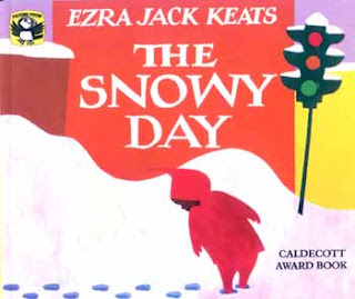
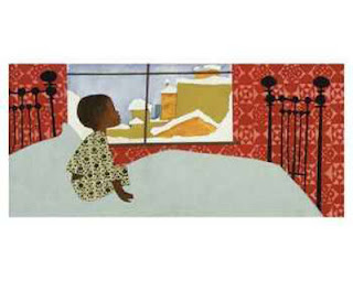
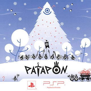
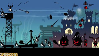
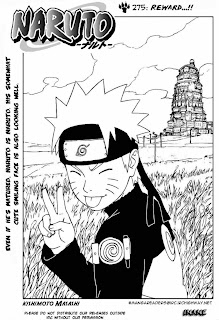
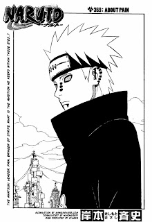
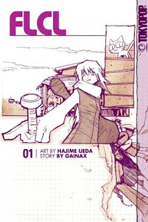
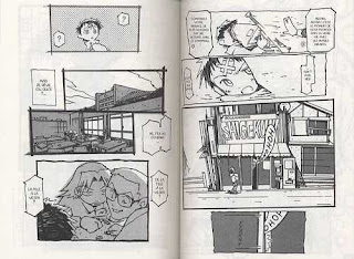
To conclude, I'll provide examples of other art styles that I'm drawing inspiration from. Notice the differences in how detail is created. Textures. Layered flat colors/shapes. Fine pen work.
~stay tuned
